Re-Designing Old Worksheets:
This page of my E-Portfolio is dedicated to the first task of Presenting Contents.
In this first task I am going to compare two worksheets,
which have the same content but are presented in a different way.
Let's find the differences!
Depending on how a worksheet is structured,
it can be more or less readable.
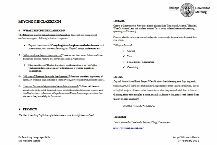
The first view, but not the only one, is the following:
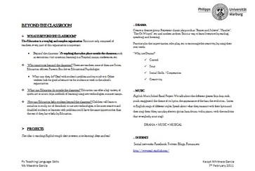
Let's look at the new structure!
In this first task I am going to compare two worksheets,
which have the same content but are presented in a different way.
Let's find the differences!
Depending on how a worksheet is structured,
it can be more or less readable.
The first view, but not the only one, is the following:
Let's look at the new structure!
After this first view we can check out these two handouts in more details
in order to find the more readable one.
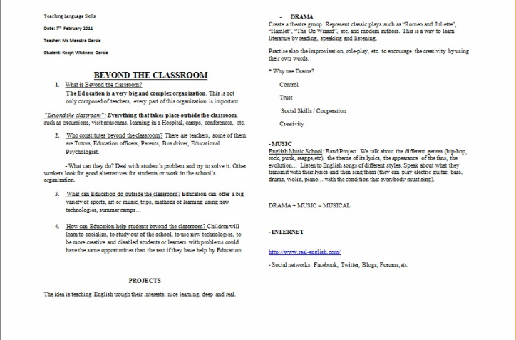
The first handout is the old one:
in order to find the more readable one.
The first handout is the old one:
And here we can check out this Re-Designed handout, which is more organized and attractive to our eyes, due to a hierarchy structure of symbols, using the university logo and filling some leftover space
at the bottom.
at the bottom.